Corporate Identity can springboard in palette consistency.
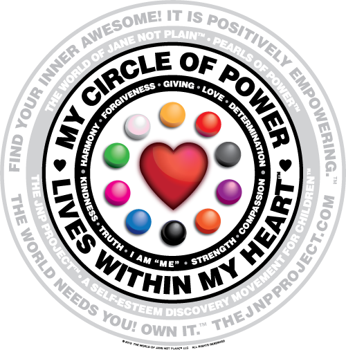 When we developed one of our key (powerful in meaning and visuals) graphic components—the Circle of Power Empowerment Badge—this image and its meaning was so important that we needed to solidify the brand color standard for its 10 main color components (correlating to the first ten books in the adventure series, Jane & Jake’s Adventures to Awesome), for each Pearl of Power.
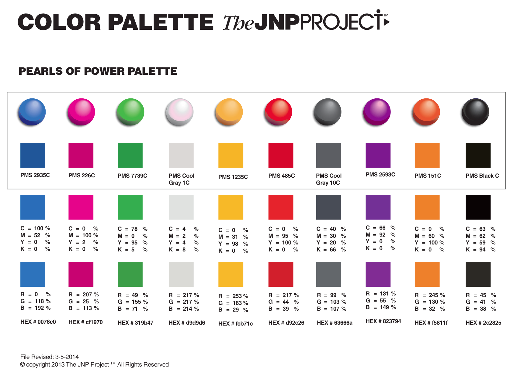
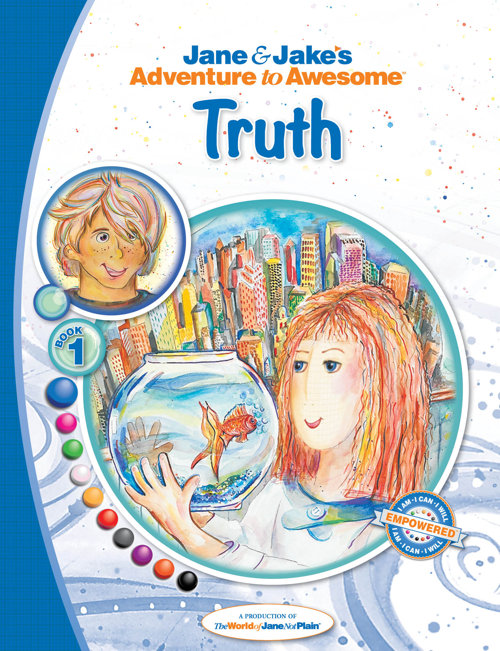
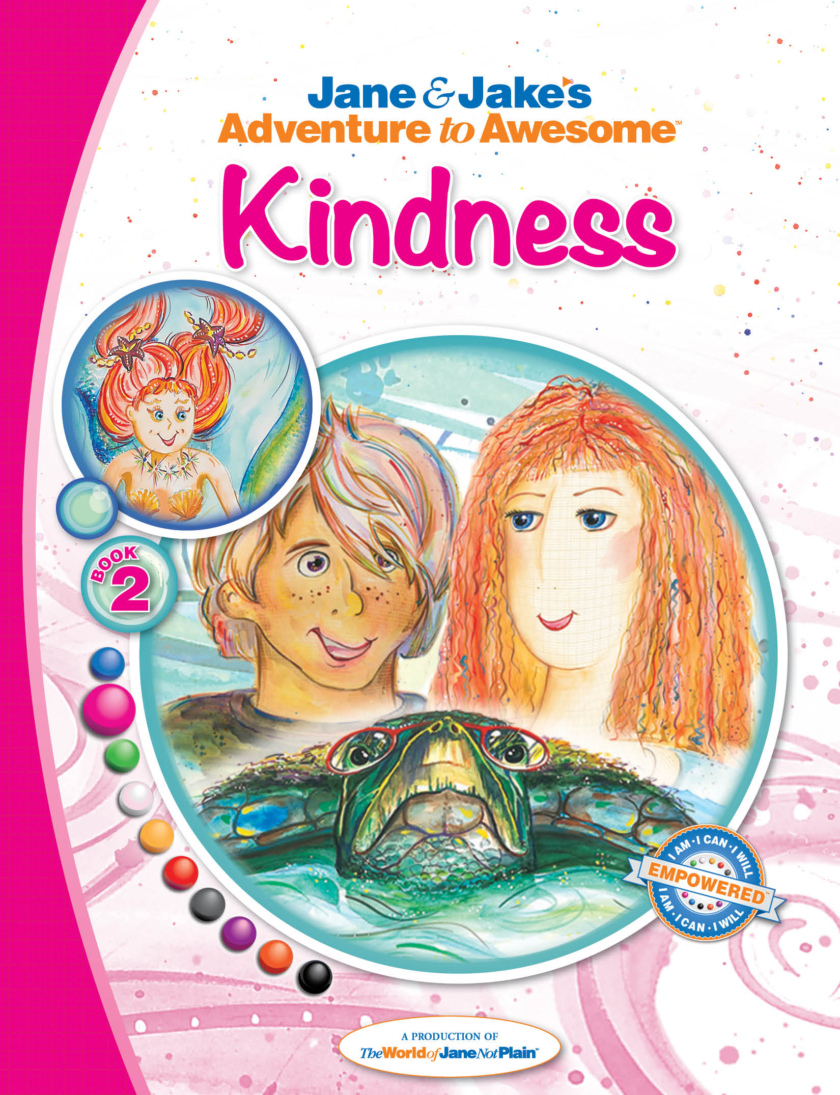
Initially we had already chosen the specific PMS (Pantone® Matching System) corresponding to each “pearl” which represented a [core virtue/value] story in the first series: Blue = Truth; Pink = Kindness; Green = Harmony; White = Forgiveness; Gold = Giving; Red = Love; Silver = Determination; Purple = Compassion; Orange = Strength; Black = Character.
![]() We spring-boarded the color palette onto the Educational Unit Guides and Parent Activity Guides icon, and then onto each individual empowerment badge, and then onto each book cover and internal theme color formats. The entire brand is a very strong, visually solid representation of The JNP Project.
We spring-boarded the color palette onto the Educational Unit Guides and Parent Activity Guides icon, and then onto each individual empowerment badge, and then onto each book cover and internal theme color formats. The entire brand is a very strong, visually solid representation of The JNP Project.
Below brand color palette; right educational & parent resources icon
Below the finalized design series of individual empowerment (electronic interactive) badges that each child will achieve once reading the story—these will be interactive and the “pie piece” can be removed and “locked” into building the empowerment badge


Below the comprehensive design development of the first series story book covers

Join Jane, Jake and all their friends on the adventures to discover your inner awesome, together!
~ ~ ~
Note: This Blog is a chronological diary of a start-up-company—The JNP Project’s Journey—reading it from the start, will broaden your understanding of the path we are on, together, and hopefully, positively influence you in some way!
FYI Tip: Color is vital to “who you are.” Make it count.
Also, for additional color branding information, review blogs:
#32: BRAND COLOR PALETTES and
#33: CHARACTER COLOR PALETTES
http://mashable.com/2013/06/09/color-schemes-business/
https://www.helpscout.net/blog/psychology-of-color/


No comments yet.