Make “YOUR” Visual Brand Count.
Whether you are just using a simple photo on a resume, or more importantly, posting “your image” to social media (either professional like Linked In, or personal like Facebook), that image IS a representation of how others perceive YOU—so, make it count!
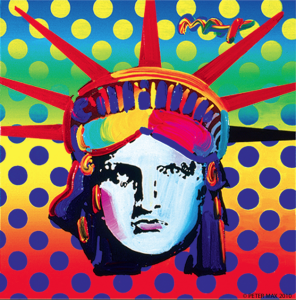
I am inspired by art, design and color. Peter Max is a favorite for fun punches of color as well as this example I included of artflakes.com of John Lennon—all really different, but with great color and graphic design embellishments to the features.


I choose a photo that was already publicly familiar to my personal brand, and embellished it with color and texture in Photoshop. I used the JNP brand colors: orange and blue. Even though my hair and eye coloring is light, I used a contrast black and white image as my base art, and built on that for color contrast—the end result is fun, artsie, and not too dramatic (keeping it a bit more conservative for professional recognition purposes).
Join Jane, Jake and all their friends on the adventures to discover your inner awesome, together!
~ ~ ~
Note: This Blog is a chronological diary of a start-up-company—The JNP Project’s Journey—reading it from the start, will broaden your understanding of the path we are on, together, and hopefully, positively influence you in some way!
FYI Tip: Whatever you decide to do with your personal brand, the most basic of photography, is to have it focused, and cropped in a visual appealing frame.
http://digital-photography-school.com/10-ways-to-take-stunning-portraits/


No comments yet.