The world is full of a rainbow-of-kids, and Jane & Jake’s Adventures to Awesome focuses on the beautiful colors that make up our inner awesome, and the compliment to that would be the colors which make up the palette of our outer awesome!

That was the next project task to complete—developing just the “right rainbow” of outer awesome colors for the series that we would apply to each of the human characters. Each character would be assigned a color from 1-10, this way we would not only give the series a wonderful social variety of character colors, but we would be adding a complimentary flavor to our already fabulous color palette.
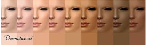
Our philosophy was to keep this palette neutral in tones so we could add to [exterior] facial and body skin with our “canvas texture,” which would then deepen the opportunity to utilize the exterior imagery as a ‘blank canvas’ ready for each child to express how they may feel and see the characters. It also enables us to emphasize different emotions portrayed through the character’s exterior skin tones, from time to time. I first researched mocha tones, and this is what I ended up with as my inspiration from Dermalicious:


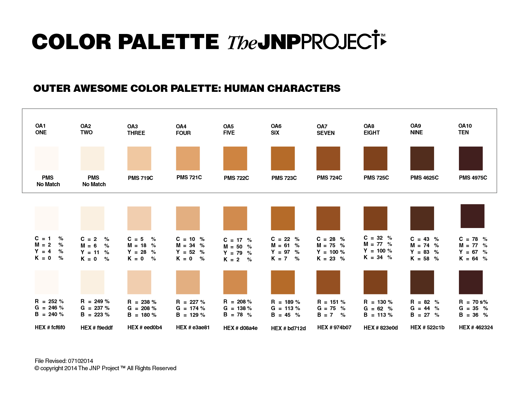
 Once I finalized the below “mocha rainbow” color palette for the series, I then applied it to Jane and Jake—Jane being 0A1, and Jake being OA5— it worked wonderfully. Jane’s “canvas texture” is a dark texture over her light skin tone, and Jake’s is light screen over his darker skin tone. This process will folow suit for all the human characters in the adventure chapter-book series.


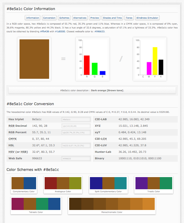
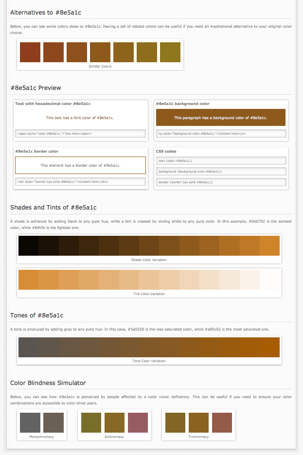
 Below an example from the colorhexa.com site— a fabulous source to see all examples of color theory, combinations and compliments.
Join Jane, Jake and all their friends on the adventures to discover your inner awesome, together!
~ ~ ~
Note: This Blog is a chronological diary of a start-up-company—The JNP Project’s Journey—reading it from the start, will broaden your understanding of the path we are on, together, and hopefully, positively influence you in some way!
FYI Tip: Color is vital to “who you are.” Make it count.
Also, for additional color branding information, review blogs:
#32: BRAND COLOR PALETTES and
#33: CHARACTER COLOR PALETTES
#34: BRAND COLOR PALETTE SPRINGBOARD
http://www.colorhexa.com/
http://www.colorhexa.com/8e5a1c
https://www.helpscout.net/blog/psychology-of-color/


No comments yet.